基本UI描述介绍的是如何创建一个内部UI结构固定的自定义组件,为了满足开发者自定义组件内部UI结构的需求,ArkTS同时提供了动态构建UI元素的能力。
@Builder
可通过@Builder装饰器进行描述,该装饰器可以修饰一个函数,此函数可以在build函数之外声明,并在build函数中或其他@Builder修饰的函数中使用,从而实现在一个自定义组件内快速生成多个布局内容。使用方式如下面示例所示。
// xxx.ets
struct CompB {
CompValue: string = ”
aboutToAppear() {
console.info(‘CompB aboutToAppear.’)
}
aboutToDisappear() {
console.info(‘CompB aboutToDisappear.’)
}
build() {
Column() {
Button(this.CompValue)
.margin(5)
}
}
}
struct CompA {
size1: number = 100
CompValue1: string = “Hello,CompValue1”
CompValue2: string = “Hello,CompValue2”
CompValue3: string = “Hello,CompValue3”
// @Builder装饰的函数CompC内使用自定义组件CompB
CompC(value: string) {
CompB({ CompValue: value })
}
SquareText(label: string) {
Text(label)
.fontSize(18)
.width(1 * this.size1)
.height(1 * this.size1)
}
// @Builder装饰的函数RowOfSquareTexts内使用@Builder装饰的函数SquareText
RowOfSquareTexts(label1: string, label2: string) {
Row() {
this.SquareText(label1)
this.SquareText(label2)
}
.width(2 * this.size1)
.height(1 * this.size1)
}
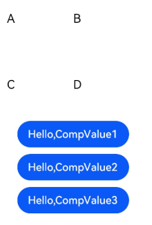
build() {
Column() {
Row() {
this.SquareText(“A”)
this.SquareText(“B”)
}
.width(2 * this.size1)
.height(1 * this.size1)
this.RowOfSquareTexts(“C”, “D”)
Column() {
// 使用三次@Builder装饰的自定义组件
this.CompC(this.CompValue1)
this.CompC(this.CompValue2)
this.CompC(this.CompValue3)
}
.width(2 * this.size1)
.height(2 * this.size1)
}
.width(2 * this.size1)
.height(2 * this.size1)
}
}
@BuilderParam8+
@BuilderParam装饰器用于修饰自定义组件内函数类型的属性(例如:@BuilderParam noParam: () => void),并且在初始化自定义组件时被@BuilderParam修饰的属性必须赋值。
引入动机
当开发者创建自定义组件,并想对该组件添加特定功能时(例如在自定义组件中添加一个点击跳转操作)。若直接在组件内嵌入事件方法,将会导致所有引入该自定义组件的地方均增加了该功能。为解决此问题,引入了@BuilderParam装饰器,此装饰器修饰的属性值可为@Builder装饰的函数,开发者可在初始化自定义组件时对此属性进行赋值,为自定义组件增加特定的功能。
参数初始化组件
通过参数初始化组件时,将@Builder装饰的函数赋值给@BuilderParam修饰的属性,并在自定义组件内调用该属性值。若@BuilderParam修饰的属性在进行赋值时不带参数(如:noParam: this.specificNoParam),则此属性的类型需定义为无返回值的函数(如:@BuilderParam noParam: () => void);若带参数(如:withParam: this.SpecificWithParam(‘WithParamA’)),则此属性的类型需定义成any(如:@BuilderParam withParam: any)。
// xxx.ets
struct CustomContainer {
header: string = ”
noParam: () => void
withParam: any
footer: string = ”
build() {
Column() {
Text(this.header)
.fontSize(30)
this.noParam()
this.withParam()
Text(this.footer)
.fontSize(30)
}
}
}
struct CustomContainerUser {
specificNoParam() {
Column() {
Text(‘noParam’).fontSize(30)
}
}
SpecificWithParam(label: string) {
Column() {
Text(label).fontSize(30)
}
}
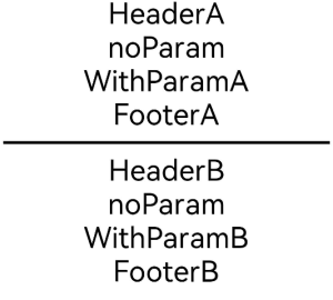
build() {
Column() {
CustomContainer({
header: ‘HeaderA’,
noParam: this.specificNoParam,
withParam: this.SpecificWithParam(‘WithParamA’),
footer: ‘FooterA’
})
Divider()
.strokeWidth(3)
.margin(10)
CustomContainer({
header: ‘HeaderB’,
noParam: this.specificNoParam,
withParam: this.SpecificWithParam(‘WithParamB’),
footer: ‘FooterB’
})
}
}
}
尾随闭包初始化组件
在自定义组件中使用@BuilderParam修饰的属性时也可通过尾随闭包进行初始化(在初始化自定义组件时,组件后紧跟一个大括号“{}”形成尾随闭包场景(CustomContainer(){})。开发者可把尾随闭包看做一个容器,向其中填充内容,如在闭包内增加组件({Column(){…}),闭包内语法规范与build函数一致。此场景下自定义组件内有且仅有一个使用@BuilderParam修饰的属性。
示例:在闭包内添加Column组件并设置点击事件,在Column组件内调用@Builder修饰的specificParam函数,点击Column组件后将自定义组件CustomContainer中header的属性值由“header”改变为“changeHeader”。在初始化自定义组件CustomContainer时,尾随闭包的内容会被赋值给@BuilderParam修饰的closer属性。
// xxx.ets
struct CustomContainer {
header: string = ”
closer: () => void
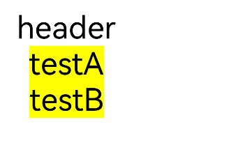
build() {
Column() {
Text(this.header)
.fontSize(30)
this.closer()
}
}
}
function specificParam(label1: string, label2: string) {
Column() {
Text(label1)
.fontSize(30)
Text(label2)
.fontSize(30)
}
}
struct CustomContainerUser {
text: string = ‘header’
build() {
Column() {
CustomContainer({
header: this.text,
}) {
Column() {
specificParam(‘testA’, ‘testB’)
}.backgroundColor(Color.Yellow)
.onClick(() => {
this.text = ‘changeHeader’
})
}
}
}
}
@Styles
ArkTS为了避免开发者对重复样式的设置,通过@Styles装饰器可以将多个样式设置提炼成一个方法,直接在组件声明时调用,通过@Styles装饰器可以快速定义并复用自定义样式。当前@Styles仅支持通用属性。
@Styles可以定义在组件内或组件外,在组件外定义时需在方法名前面添加function关键字,组件内定义时则不需要添加function关键字。
// xxx.ets
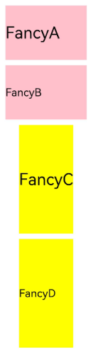
function globalFancy () {
.width(150)
.height(100)
.backgroundColor(Color.Pink)
}
struct FancyUse {
componentFancy() {
.width(100)
.height(200)
.backgroundColor(Color.Yellow)
}
build() {
Column({ space: 10 }) {
Text(‘FancyA’)
.globalFancy()
.fontSize(30)
Text(‘FancyB’)
.globalFancy()
.fontSize(20)
Text(‘FancyC’)
.componentFancy()
.fontSize(30)
Text(‘FancyD’)
.componentFancy()
.fontSize(20)
}
}
}
@Styles还可以在StateStyles属性内部使用,在组件处于不同的状态时赋予相应的属性。
在StateStyles内可以直接调用组件外定义的@Styles方法,但需要通过this关键字调用组件内定义的@Styles方法。
// xxx.ets
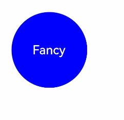
function globalFancy () {
.width(120)
.height(120)
.backgroundColor(Color.Green)
}
struct FancyUse {
componentFancy() {
.width(80)
.height(80)
.backgroundColor(Color.Red)
}
build() {
Row({ space: 10 }) {
Button(‘Fancy’)
.stateStyles({
normal: {
.width(100)
.height(100)
.backgroundColor(Color.Blue)
},
disabled: this.componentFancy,
pressed: globalFancy
})
}
}
}
@Extend
@Extend装饰器将新的属性方法添加到Text、Column、Button等内置组件上,通过@Extend装饰器可以快速地扩展原生组件。@Extend不能定义在自定义组件struct内。
// xxx.ets
(Text) function fancy (fontSize: number) {
.fontColor(Color.Red)
.fontSize(fontSize)
.fontStyle(FontStyle.Italic)
.fontWeight(600)
}
struct FancyUse {
build() {
Row({ space: 10 }) {
Text(“Fancy”)
.fancy(16)
Text(“Fancy”)
.fancy(24)
Text(“Fancy”)
.fancy(32)
}
}
}
@Extend装饰器不能定义在自定义组件struct内。
@Extend装饰器内仅支持属性方法设置。

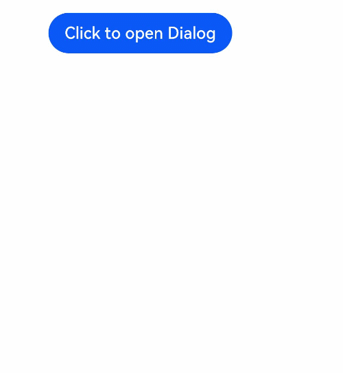
@CustomDialog
@CustomDialog装饰器用于装饰自定义弹窗组件,使得弹窗可以动态设置内容及样式。
// xxx.ets
struct DialogExample {
controller: CustomDialogController
action: () => void
build() {
Row() {
Button(‘Close CustomDialog’)
.onClick(() => {
this.controller.close()
this.action()
})
}.padding(20)
}
}
struct CustomDialogUser {
dialogController: CustomDialogController = new CustomDialogController({
builder: DialogExample({ action: this.onAccept }),
cancel: this.existApp,
autoCancel: true
});
onAccept() {
console.info(‘onAccept’);
}
existApp() {
console.info(‘Cancel dialog!’);
}
build() {
Column() {
Button(‘Click to open Dialog’)
.onClick(() => {
this.dialogController.open()
})
}
}
}